
A single overview screen that replaces five scattered reports — users, revenue, orders and traffic all readable in one glance, without a second click.
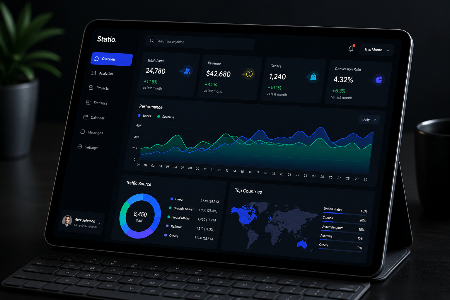
Before Statio, the team was checking revenue in one tool, traffic in another, and orders in a spreadsheet nobody trusted. Every status update meant opening three different logins just to answer one question: how are we doing this month?
The brief was simple to say and hard to build well — one dashboard, fast to load, honest with the data, and readable by someone who has thirty seconds between meetings, not thirty minutes.
Users, Revenue, Orders and Conversion, each with a colored change badge against last month.
A dual-line chart tracking Users against Revenue across the full month, with a Daily/Weekly toggle.
Direct, Organic, Social, Referral and Others broken down by session count and share.
A world map paired with a ranked list of markets, each with its own progress bar.
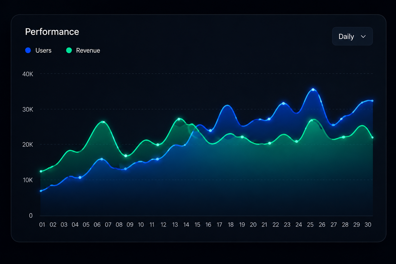
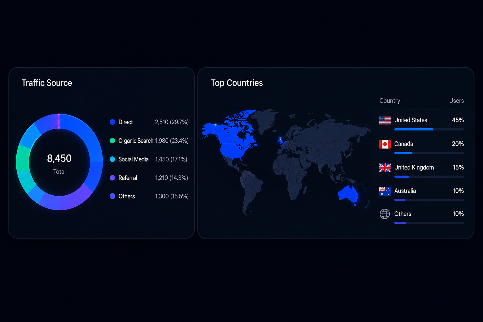
The interface was designed and built on WordPress, using Elementor Pro as the layout base, with custom HTML, CSS and JavaScript layered on top for the parts a standard page builder can't do on its own — the live performance chart, the animated donut, and the dark glass-panel cards seen throughout.
“I open Statio once in the morning and I already know how the day looks — users, revenue, where traffic is coming from. I don't need five other tabs anymore.
— Alex Johnson, Admin
Every panel was scoped to answer one specific question, rather than crowding several metrics into a single busy chart.
Let's talk about what your team actually needs to see every morning.
A premium furniture brand needed an online store that felt as considered as the pieces it sells — warm, editorial, and easy to shop on any device.
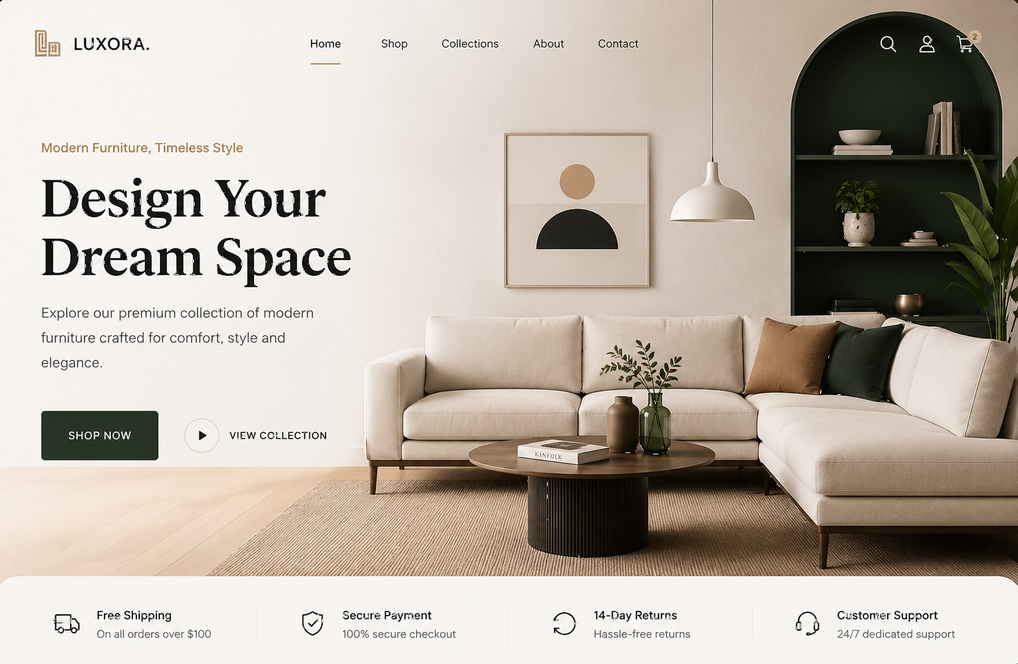
Luxora's previous site was a generic template — small thumbnails, a cramped header, and nothing that hinted at the quality of what was actually for sale. Visitors were judging the furniture by a website that didn't do it justice.
The brief was to build a landing experience led by photography, with a clear path to Shop Now or View Collection, and enough trust signals above the fold that a first-time visitor felt comfortable buying without leaving the page.
Full-bleed lifestyle photography paired with a serif headline and two calls to action — Shop Now and View Collection.
Home, Shop, Collections, About and Contact sit in a minimal top bar, with search, account and cart kept out of the way until needed.
Free shipping, secure payment, returns policy and support sit directly under the fold, answering objections before they're asked.
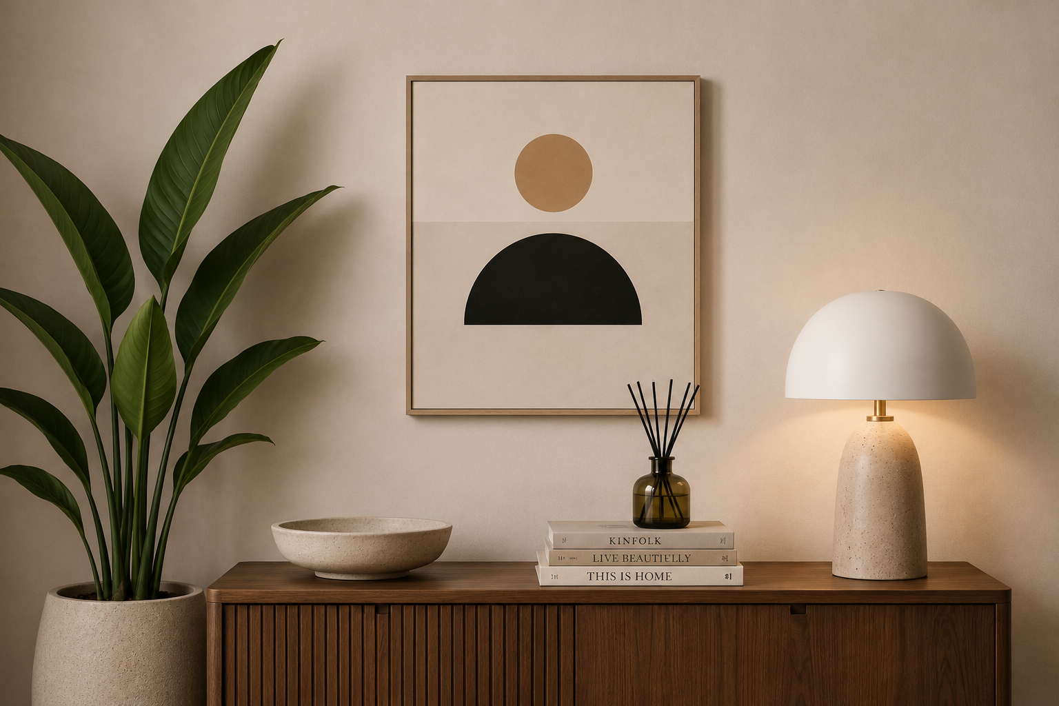
Cream, walnut and forest green tie the site's colors to the furniture itself, instead of a generic white e-commerce template.
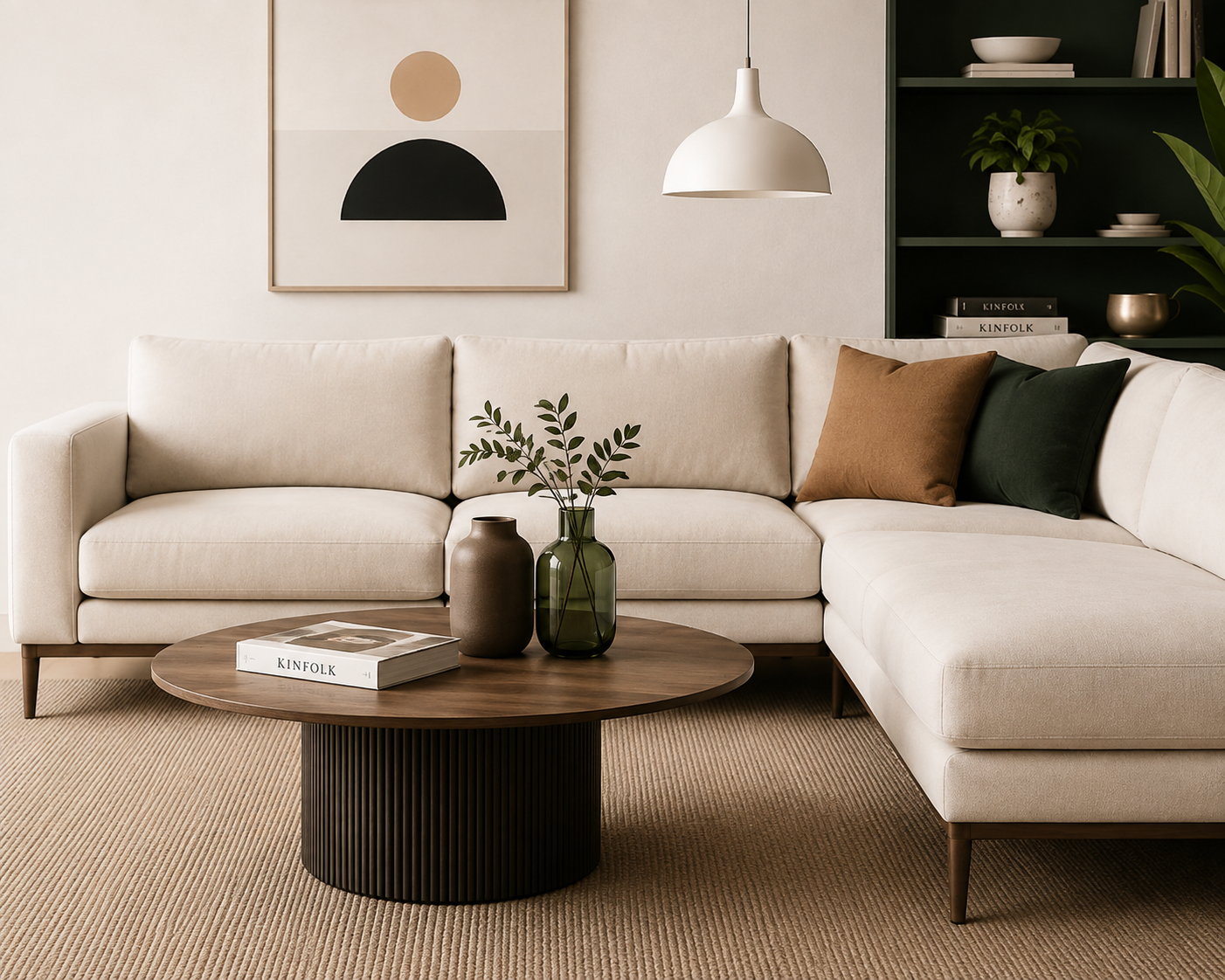
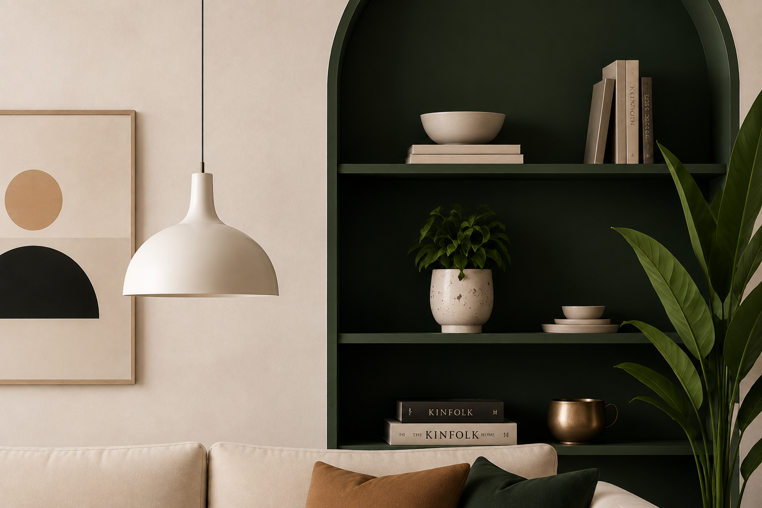
The site was designed and built on WordPress, using Elementor Pro for the layout and WooCommerce for the shop and checkout flow, with custom CSS handling the serif-and-sans typography pairing and the arched display-shelf detail featured in the hero.
“Customers finally stop scrolling on the homepage instead of bouncing straight to Shop. The photography does more selling than our old product copy ever did.
— Founder, Luxora
Every layout decision left room for the furniture itself to be the loudest thing on the page, not the interface around it.
Let's talk about turning your catalog into an experience people want to browse.
A homepage that had to do double duty — sell the agency's services, and prove its design ability at the same time, before a visitor ever opens the portfolio.
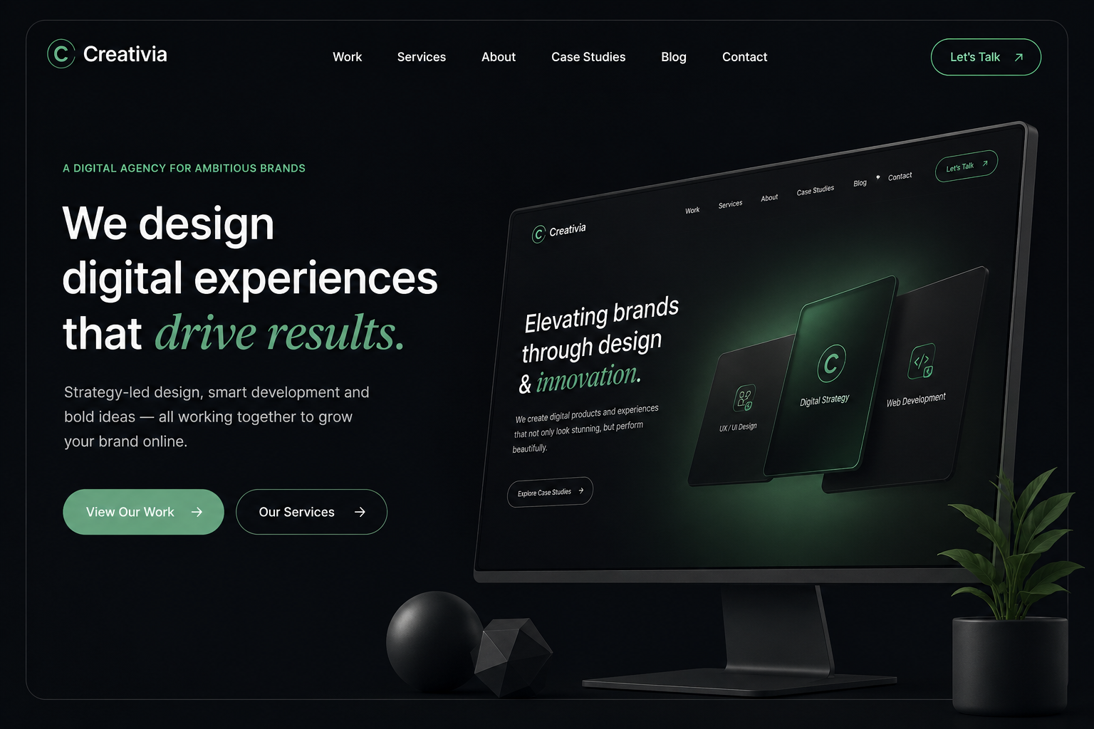
Creativia's old homepage used a stock hero photo and a layout that could have belonged to any studio. For a company selling design, that was the one thing the homepage couldn't afford to look like — generic.
The brief was to build a homepage that used the agency's own visual language — dark backgrounds, gradient accents, a 3D hero element — so the design ability being sold was visible on page one, not three clicks into the portfolio.
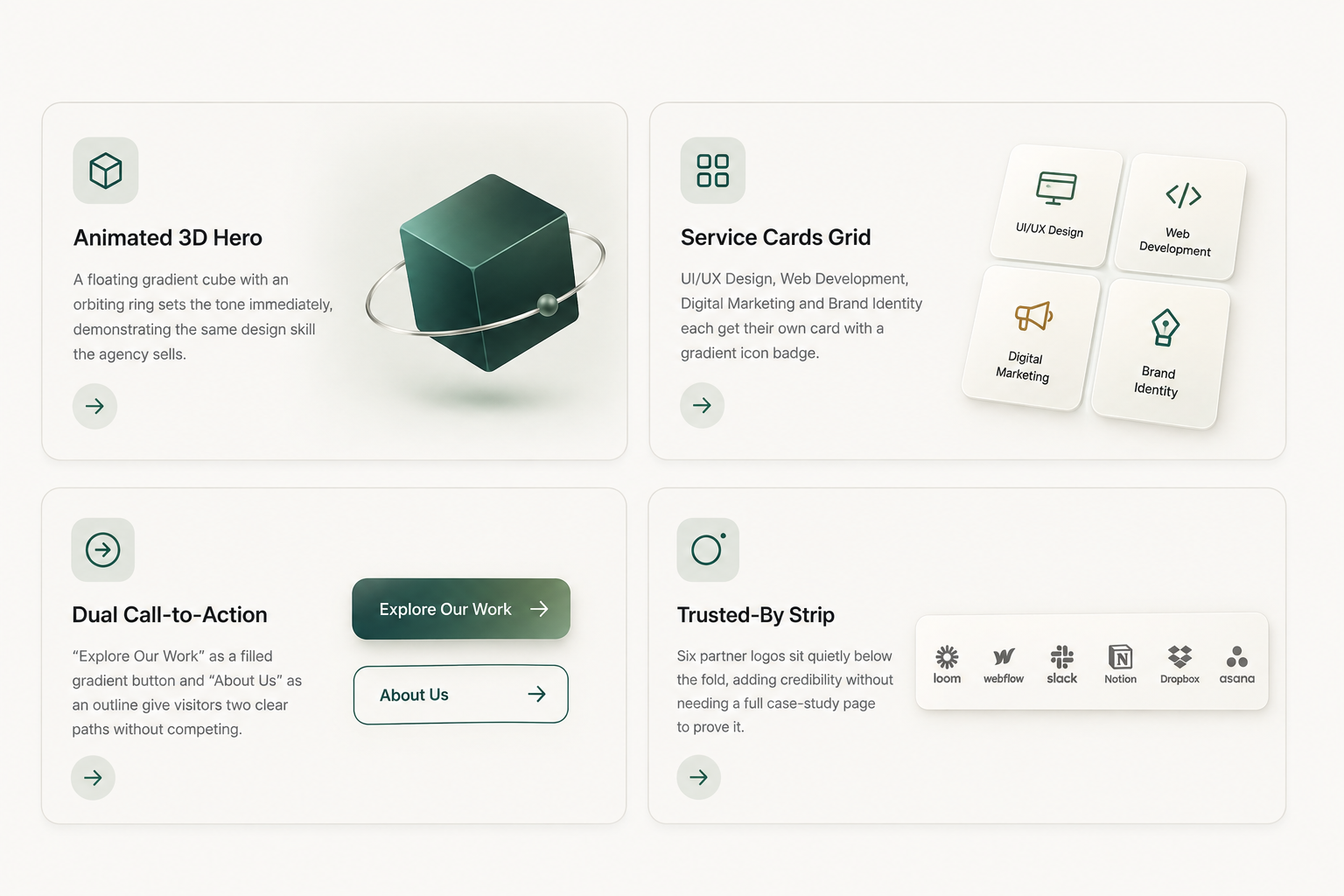
A floating gradient cube with an orbiting ring sets the tone immediately, demonstrating the same design skill the agency sells.
UI/UX Design, Web Development, Digital Marketing and Brand Identity each get their own card with a gradient icon badge.
"Explore Our Work" as a filled gradient button and "About Us" as an outline give visitors two clear paths without competing.
Six partner logos sit quietly below the fold, adding credibility without needing a full case-study page to prove it.
The homepage was designed and built on WordPress, using Elementor Pro for the layout and custom CSS and JavaScript for the gradient cube animation, the orbiting ring, and the light/dark mode toggle in the navigation — details a standard page builder can't produce on its own.
“Clients used to ask for our portfolio before believing we could design. Now the homepage itself closes half of that conversation before the call even starts.
— Creative Director, Creativia
Every choice on the page had to justify itself the way it would in client work — nothing added just to fill space.
Let's talk about a homepage that sells your work before the portfolio even loads.
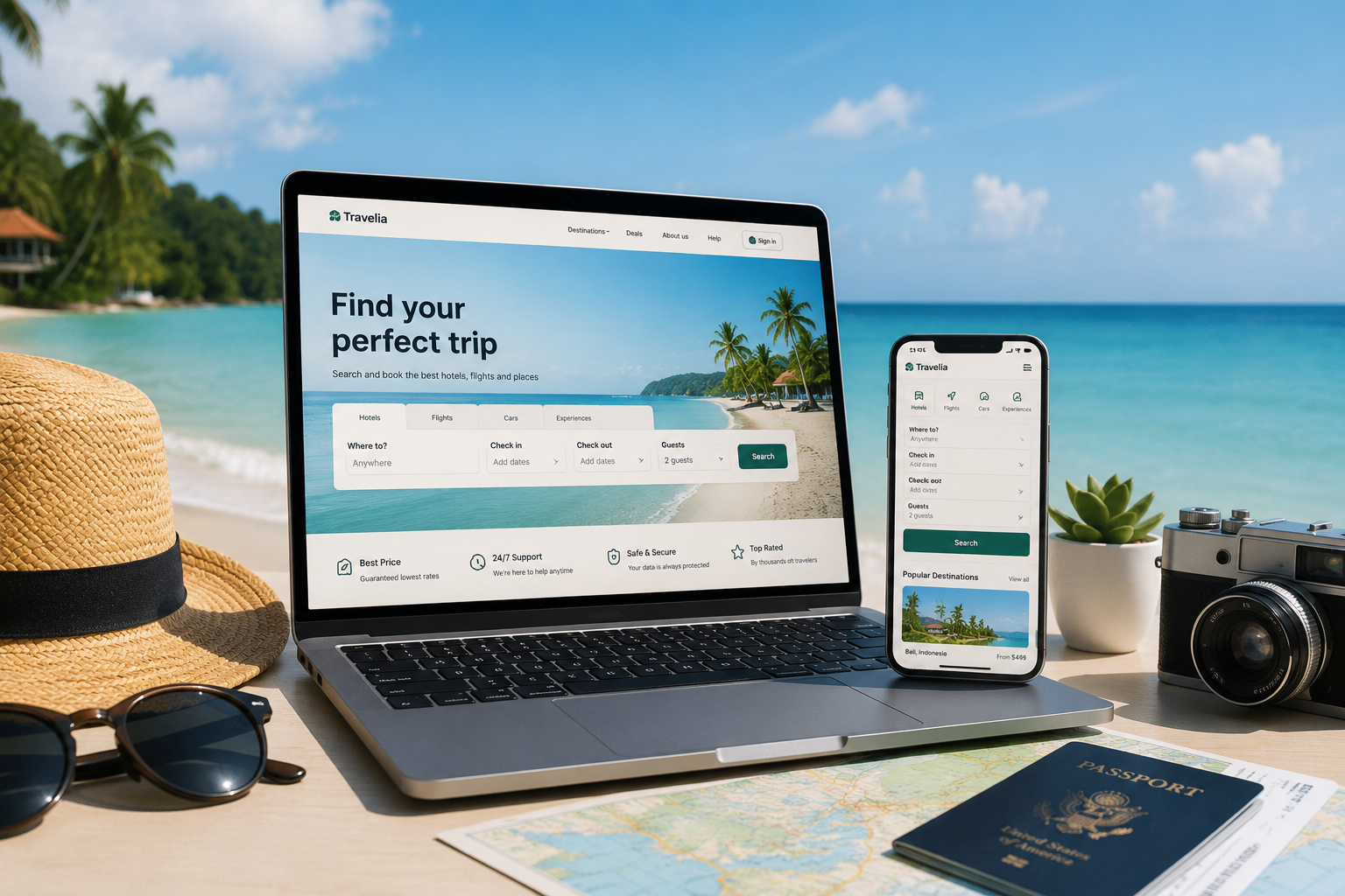
A travel platform that lets a visitor start searching for a trip before they even finish scrolling past the hero — no extra clicks, no separate search page to hunt for.
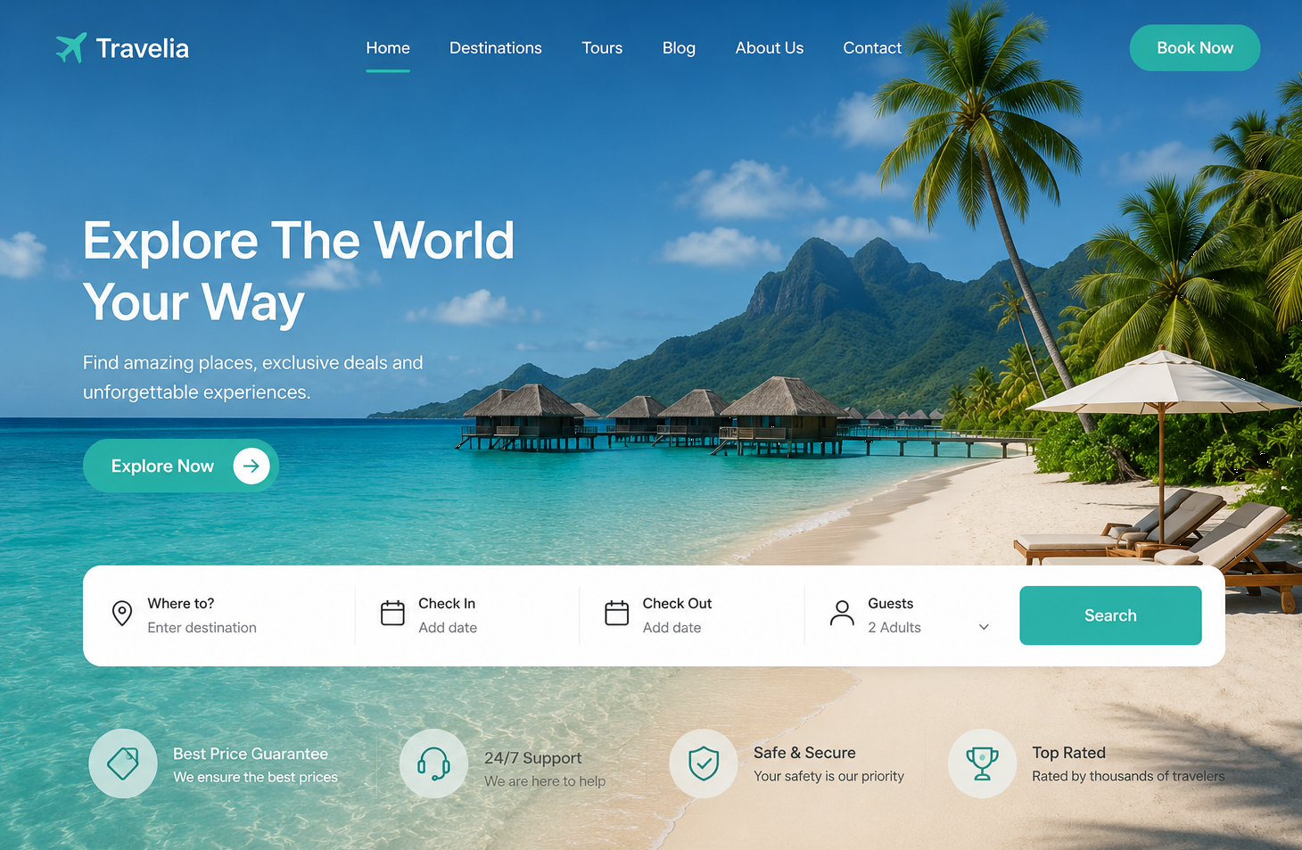
Travelia's old homepage was a photo slider and a "Search Flights" button that led to a separate page. By the time a visitor found the actual search form, half of them had already left.
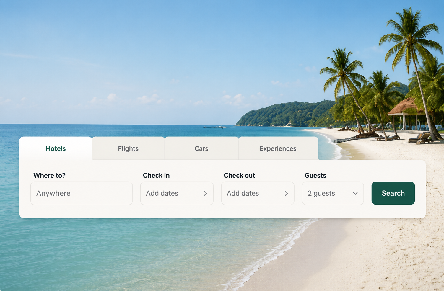
The brief was to put destination, dates and guest count directly over a single striking hero image, so the first thing a visitor does on the page is start planning a trip, not look for where to click next.
One striking hero image instead of a generic slider, setting the mood before a single word is read.
Where To, Check In, Check Out and Guests sit directly over the hero, so searching is the first action, not the last.
"Explore Now" and "Book Now" are the only two buttons competing for attention, each doing exactly one job.
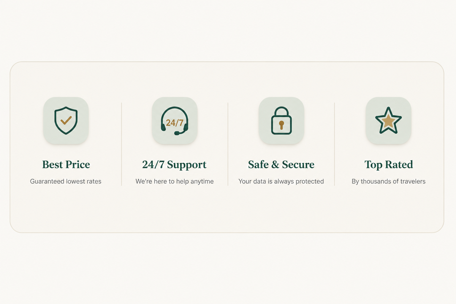
Best Price, 24/7 Support, Safe & Secure and Top Rated build confidence before the visitor even opens a listing.
The homepage was designed and built on WordPress, using Elementor Pro for the layout and custom CSS and JavaScript for the date-picker interactions and guest-count dropdown inside the search widget — pieces a standard page builder doesn't handle on its own.
“People used to bounce off the homepage looking for the search bar. Now they land, pick their dates, and hit search in under ten seconds.
— Marketing Lead, Travelia
Every decision was made to shorten the distance between landing on the page and starting an actual search.
Let's talk about turning your homepage into a search bar people actually use.